I spent a little time this past weekend preparing some more fabrics to sell at Stashfest, as a donation to both the La Conner Quilt and Textile Museum and the Contemporary QuiltArt Association.  These pieces were mostly started at our CQA meeting playdate, where we got together to create fabrics for this fun event.

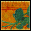
 This first piece was one that I made with a variety of techniques and materials.  It is approximately 1 yard square of raw silk.  I started with doing different stencil images using fabric marking pens.  From there, I added some bits of Shiva Oil Paintsticks, with a rubbing plate.  The final step was to overdye it with Dye-Na_flow.

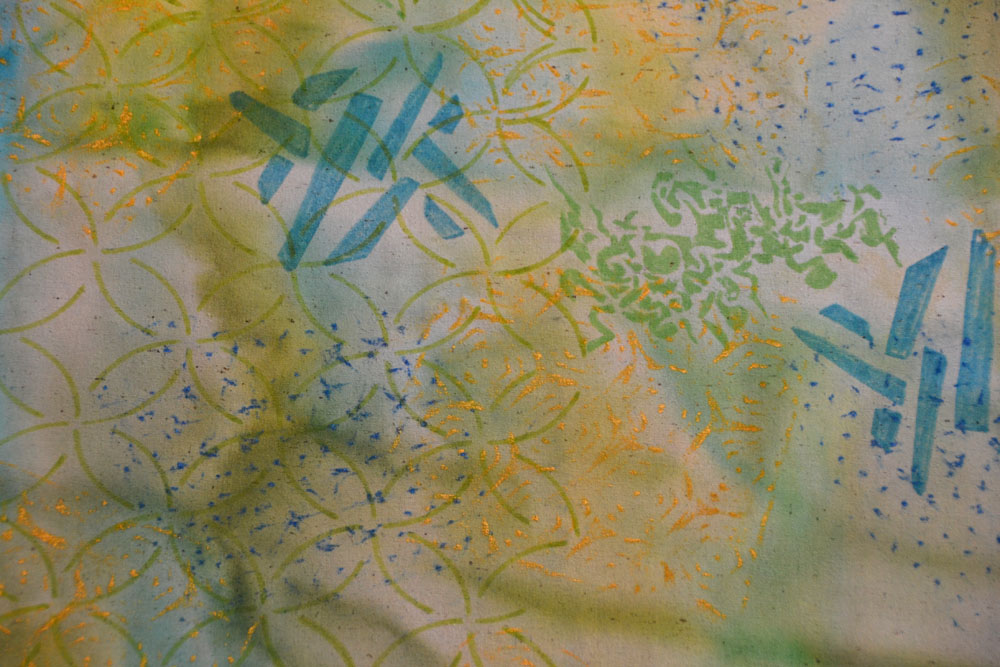
It’s a little easier to see the detail in a close-up shot.

 This lovely piece was created by one of the  other members of CQA, using Shiva Oil Paintsticks and a rubbing plate.  I love how she overlapped the designs, giving it a “spirograph” effect.  I brought it home from the playday, ironed it to set the oil paint, and then overdyed it.  The darker stripes of the fuscia dye that I used are created by bunching the fabric when it is drying.  You’d think the darker would be in the gullys between areas that are bunched higher up, but instead, the dye actually travels up to the higher areas.

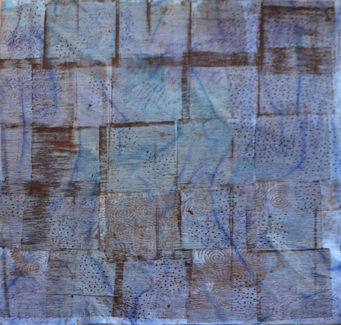
This piece is also harder to appreciate without the detailed photo, but it’s really fantastic!  Again, another CQA member did the surface design and then I overdyed and ironed to set the colors.  This was made with a thermofax silkscreen, which created the brown lines.  Some of these were overlapped, making the darker brown sections.

In the detail photo below, you can see the block prints and shiva paintstick rubbings that also decorate this piece.  About a yard square, this is made of white cotton, which I’ve then dyed.

This final photo is of four roughly fat-quarters of raw silk, which I’ve dyed in various green shades.  If I have time, I’ll probably add more surface design to them as well.  

Speaking of time… I’m off to a 5 day class in the morning at Gail Harker’s Center for the Creative Arts.  I’m finishing up the 100 level certificate classes this week (with Experimental Hand Stitch) and will be going on to the 200 level coursework starting in May.  That series will take about 2 years to complete, with classes every 3 months (and lots of homework in between!) If you’re interested in seeing the kind of work that comes from Gail’s students, check out my posts on her student’s exhibition, Complex Threads.  I’ll update you on how the class is going this week!

You Might Also Be Interested In:

CQA Surface Design Party Viewing for Inspiration Complex Threads 1
“Corn” by Christina Fairley Erickson
Machine Freehand Embroidery, decorative stitching, freemotion quilting

Red!  Thanks for all the comments, encouragement and opinions on the background for my corn piece.  The little ends of the corn husk were challenging to applique down, but you can see a bit of the organza husk standing up in the picture.  What you can’t really tell from the photo is how much the trapunto stands out.  The two longer corn rows have 5 extra layers of batting, making them stand about 3/4″ up from the backing. I cut each of the batting layers a little smaller than the last, so it really has a rounded look.  The lower ear of corn has less trapunto (3 layers), since it is behind the others.


I’m now working on my last piece, chili peppers.  I started with the green stems, then went on to the darker shadowed portions of the chili.

The difficult part of these is that they are so thin, it will be difficult to convey a 3-D effect or to trapunto them.  So I tried to sew both in the long/horizontal direction and also around the width of each chili, to convey the roundness of each.

One of the main things when doing thread painting is to keep on layering your colors to add more dimension and gradation.  If you just fill in one color butted up to the next, it will look flat and like a paint-by-number painting.  Blending the colors is very important.  Also, look for the unexpected colors.  In this chili, I found a small place where the shadow had just a touch of lavender… it adds a lot to the finished piece to have those little bits that your eye might not originally catch.

Finished “Chili” thread painting
Now I just need to do the background and then I’ll be on to putting all 9 of my Salsa blocks together!
You Might Also Be Interested in:

Corn – Red or Orange- 
You Vote!
Piquant Progress Fitting My Challenge 
with Showing

Please check out these other great blogs:

FreeMotion by the River by Connie Kresin

Quilt Story

Well, I’m down to needed to pick out the background and do the freemotion quilting on my latest Salsa block- Corn.  I’m not sure about the background color, however.  Do you prefer the red or the orange?

This may have been the most difficult of my salsa pieces to date.  Trying to get individual kernels of corn was tricky.  I also wanted to have the husk seem more realistic, which I may work on a bit more.

Nylon organza pieces painted with Dye-na-Flow

I started thinking about the husk and how to make it seem like it could be peeled away.  I decided to use a painted nylon organza, which you could get layers of sheer that would build color.  I used Jacquard Dye-na-Flow to paint it, mixing a variety of greens and yellows.

Nylon organza hanging to dry

When you paint the nylon organza, do it on a thin plastic sheet and wait until it is just starting to dry (it will be semi-sticky to the plastic.)  Then, peel it up and hang it to dry with clothes-pins or paperclips to a line.  If you leave it on the plastic, much of the paint will stay on the plastic and the surface of the organza gets a shiny odd texture to it.

After painting my organza, it was time to get going with the thread painting.  Starting with a photo I’d printed on fabric, I began with the very lightest color first.  Much of these pieces were sewn in little circles, to imitate the shape of the corn kernels.  At some places it was more appropriate to make little scallops, to add highlighting or shadowing to the kernels.

I then layered on color after color of a range from pale beige through sunshine yellow to a dark mustard.  In between the rows, oranges predominated to add shadowing… even a touch of a pinkish-orange.

At the end, I added more of the sunshine and lighter colors again, to build up layers and make the kernels a little more dimensional, with the highlights sticking out.

Corn with thread-painting over all, including husk


After the corn itself was complete, I thread-painted the husk.  I’m not completely sure about my process here or whether I need to do more (or even take away some of what I did.  After the thread painting, I laid some of the organza which I had painted on top and stitched it down.  I didn’t stitch it entirely over the husk areas, as I wanted some of the pieces to be able to fold back and move in a breeze, like a real husk would do.  After sewing it down, I cut around the edge of my sewing.

Completed corn with the organza husk

So, what do you think?  Red or Orange for the background?

By the way, as many of you know, I’m a big fan of Leah Day’s FreeMotion Quilting project.  If you’re looking to gain skill in freemotion quilting, Leah has just come out with a new class on Craftsy.  If you go to her blog, you can click a link and get the class for half price!  ($19.99 rather than 39.99.)

You Might Also Be Interested in:

A Slice of Lime Peppers and Avocado Cilantro – Si!

Make sure to check out these other great blogs!

Confessions of a Fabric Addict

Great post on stenciling and thermofax on Nina Marie Sayre’s Art Quilts

It’s hard to believe that we’re almost at the middle of March… almost 1/4 of the year is done!  However, with that in mind today, I thought I should review and see how I’m doing on My Goals for the year.

“Best Friends” by Christina Fairley Erickson
Commercial and artist hand-painted cottons, machine applique, machine free-motion quilting
My first goal is to work on finding and defining my artistic voice.  I’ve outlined several steps to help myself with this.  First, is to work with Gail Harker, of the Gail Harker Center for the Creative Arts.  You might recall some of my previous posts about the fantastic exhibit, Complex Threads, which featured the work of students of Gail.  I’m set for this part of my goal, starting next week when I’ll be taking her Experimental Hand Stitch 101 course. This course will complete my 100 level series classes, and I’ll be continuing on the path starting in May with Studies in Design and Experimental Hand and Machine Stitch 201 which will meet approximately every 3 months through the end of 2014.  
“Best Friends” detail by Christina Fairley Erickson
Next, I decided to kick up my production to help with defining my artistic voice.  To do this, I’ve been making my weekly 5 x 7 Challenge piece.  So far, I’m keeping up with this (one week I didn’t finish, but then did two in another week.)  I also wanted to do my small art quilt group’s challenge every other month.  I’ve only got a couple weeks to go to finish this and I’m not sure that I’m going to make this one.  The theme of the current Fiber Funster Challenge is “Waiting.”  while I have designed a piece, I haven’t even started it in production.  Maybe I can get it going this weekend.
Finally, I planned to document my progress in my blog, which I’ve been doing.  This also has helped me with my second major goal, which is to ramp up my pictorial quilts.  I feel like I’ve made a lot of progress through the weekly production of 5 x 7 pieces, both with my technical skills and composition.  I do still need to start working on a plan for creating a body of work.  
My third goal has to do with studio organization.  Here I have made some progress, but not enough to be proud of… I am at least working in my studio almost daily, rather than my studio being such a disaster area that I end up pulling my work out into other areas of the house!
My next goals, opening an Etsy shop and working towards a solo show in 2015 are still in the thought process, although I have looked through Etsy and think I can stay on track to open by mid 2013.  Beyond that, I’m on track for completing my piece for the Salsa show (entry due in mid-April).  I haven’t yet decided upon my second medium-to-large sized piece to create, although I may go back to my roots and make another horse-themed quilt.  I won a first place (and cash prize!) at an equine art-show two years ago and just received the call for entry for this coming summer. Alternatively, I may shoot for finishing one of my works in progress, such as my Waterfall quilt or Cathedral Visions.  
I’m scratching the final goal, completing a driftwood art sculpture in time to enter in the May show.  Although I love the driftwood art, I’m not having the time to do it as well as my main love, fiber.  
Well, I’m in a bit of overwhelm now, with all that I need to do.  Guess it’s time to get back to sewing!
The background of these poppies is pieced with a traditional feel
Artist unknown

I love how some quilters mix the old with the new.  I think this is a wonderful way to honor the traditional roots of quilting.  I’m always amazed at how some quilters can make such beautiful pieced backgrounds that totally enhance their subject using traditional piecing.

This group quilt shown at the Pacific West Quilt show in 2011 uses a blend of traditional-feeling piecing
and shadow imagery very effectively

One quilter who mixes traditional log cabin blocks with contemporary portraits was featured at the Bellevue Art Museum’s “High Fiber Diet” show.  Luke Haynes repurposes old, discarded clothing into the block backgrounds of his quilts.  The pictorial foregrounds are unique… he asked friends to come and pose for a photo session.  Not only did he use the portraits to make the content of the picture, he had his models leave behind the clothes they wore in the photo shoot… and then he used their clothing for their portraits!

Clothes Portrait #1 – Cupcake by
Luke Haynes
Clothes Portrait # 2 – Helmet
by Luke Haynes
Camera by Luke Haynes

Tree quilt displayed at Block Party Quilters show
in 2009- Artist unknown

While this tree may seem simplistic in style, the background brings thoughts of upcoming winter with the blues and purples and neutrals in combination with the yellowing autumn leaves.  Also, the complementary colors of the yellow with purple help make the quilt more interesting.

I’d like to apologize to any artists whom I do not have their names… I have taken many pictures over my many years of quilting of quilts I’d admired to look at for inspiration.  Unfortunately, I wasn’t always as careful to note the artist’s name or name of the piece in the past. I hope that my sharing of your quilt for other’s inspiration will be seen as praise for your skills.  If you know the name of any artist or piece that I do not have attributed, please let me know and I’ll correct it.

Do you have any quilts that combine the traditional with the contemporary?

You might also be interested in:

BAM High Fiber Diet A Sprig Away Developing the 
Creative Habit

See some fabulous quilts on Connie Kresin’s Freemotion by the River

Check out all the linked up blogs of quilts and projects on Quilt Story

Limes by Christina Fairley Erickson
Freehand machine embroidery, freemotion quilting and decorative stitching

Do you get more and more productive the closer you get to a deadline?  This is a pet peeve of mine (not to mention my husband’s!)  Why is it that we have to get right up to a deadline before we get motivated?  I really thought that with my finishing each of the 5 x 7 pieces each week, I’d be looking great for the Salsa show’s deadline of April 6.  Perhaps I am doing fine… it’s a bit hard for me to know, since I’ve never made a quilt-as-you-go quilt.  I suppose I’m worried that putting it all together will prove a bit harder than I’ve imagined.  Two more 5 x 7 blocks to go.

Here are the other pieces completed so far:

Any thoughts on what I should do for sashing and putting them all together?
The lime seemed like it might be a bit tricky- there was a lot of reflective light in the photo and the juiciness of the cut lime.  I decided to start with the darker parts of the sliced half, and then added progressively lighter colors.  For the whole lime, I began with the outer edges (the parts furthest away) and worked my way towards the center.  
When I finished the machine embroidery, I completed the background with more decorative stitching and freemotion quilting.  I used the same sort of squared stippling that I’d used with the Peppers, which I’d learned on Leah Day’s FreeMotion Quilting Project.

Finally, I added the limes on top with extra batting to give them dimension (hand applique.) 

Working on the freemotion quilting
Quilted background completed

You Might Also Be Interested In:
5 x 7 Week 3- The
 Start of Salsa!
New 5 x 7 Challenge
Pieces 
Juggling Many 
Projects

Blogs I Recommend and Link-up:

Freemotion Quilting Project

Freshly Pieced

Nina Marie Sayre’s Art Quilts

Quilt Matters

Richard and Tanya Quilts

Confessions of a Fabric Addict

Only 3 more 5 x 7 pieces to go for my Salsa series!  They’re looking good all together.  I was a little worried that this red background might be too dominant with the rest of them, but it turned out fine.  I wanted the complementary color to the green of the avocado, and the dark skin of the fruit allowed me to use something quite bold… there’s no way that the pieces will fade into the background.  I’m still trying to figure out how I’m going to tie all the pieces together- I’m leaning towards black sashing that is freemotion quilted throughout.  I’d love to hear any thoughts or suggestions you might have about putting these pieces together into a quilt.

Yesterday I was reading one of my old favorite inspirational books, Simple Abundance: A Daybook of Comfort and Joy by Sarah Ban Breathnach.  Each day of the year has a separate little essay that looks for finding joy in your everyday life.  I’ve had this book and referred to it for probably about 15 years (it was published in 1995.)  It’s a lot like a wonderfully inspirational blog!  Anyway, the entry for March 4 is called “Priming the Pump for Inspiration” and uses the analogy of how you used to have to pour water into a pump to get it started.  Likewise, as artists, we need to feed ourselves images and experiences to keep the flow of creativity.

Similarly, Twyla Tharp, the famous dancer and choreographer, talks about setting rituals to get your creativity flowing.  If you set up a structure of doing the same thing each time you sit down in your studio (or on the way to your studio)… something that is inspirational, or centering, or creates peace for yourself… you will start to get greater access to your creative side.

I can’t say that I’ve got this process of ritual down at all.  I do lots of things to “prime my pump”, whether it be taking photos, cutting out images from magazines and putting them in sketchbooks, or reading books and blogs which I find inspirational.  But, typically I feel a little pressed for time and that I need to produce when I’m in my studio.  I’m rethinking this.  Perhaps I would be better served creatively to take the extra time, slow down a little bit, and follow a set ritual each day to start opening up my right-brain creative side.

You Might Also Be Interested In:

Developing the 
Creative Habit
Peppers and Avocado Cilantro – Si!

Some of my Favorite Blogs:

Leah Day’s FreeMotion Quilting Project

Connie Kresin’s Freemotion by the River

Nina Marie Sayre’s Art Quilts

Freshly Pieced

Quilt Story

Confessions of a Fabric Addict

Quiltsy

Do you feel like you are meeting your potential?  Or do you feel like you haven’t quite made it or like you aren’t really even sure how to get to what you think your potential might be?  
This question is on my mind after celebrating my son’s Eagle Scout Court of Honor yesterday.  I made a slideshow for the program, with pictures of my son’s scouting activities- from first grade through his Sr. year of high school.  It hasn’t always been an easy road… he was even asked to take some time off from scouting at one point.  However, I can now see how all the effort (on both his and my parts) has paid off.  He’s made a great step towards meeting his potential.
“By a Nose” by Christina Fairley Erickson
My quilt won a 1st place at an Equine Art Show… however
it’s done with a technique I learned from Noriko Endo…
does that then truly represent my artistic voice?

One of my quests this year in my 5 x 7 Challenge, beyond the concept of how making art each and every week will help the quality of my work, is to find my authentic voice as an artist.  Finding your voice as an artist seems to be a tricky thing for many of us.  I’ve tried many styles of quilts and am still working out how to have my work represent who I am, and not be something you look at and say… “Oh that looks like ____________(put well-know quilt artist’s name here) work.”  My work should look like Christina Fairley Erickson’s work.

I’m clear that I like pictorial or representational work.  I also like stitch, both machine and hand.  So those are the areas I’m exploring.  But the ways in which I put them together need to be my own.  
I thought I’d share another of the artist’s work from the Bellevue Art Museum’s “High Fiber Diet” exhibit.  Maria Shell, of Anchorage AK, spent a year exploring the potential of variations of pattern over the course of many grid pieces.  Each of the nine pieces is made from vintage and contemporary commercial cotton textiles, hand-dyed fabric, batting and thread. So, your basic quilting components.  
Maria felt that by limiting the structure of her work to the grid, she was able to fully explore color… how to make color vibrate on the wall.  She discovered that the proportion of line and shape in the relation to color evokes different experiences in each piece.  The shot below is looking at a towering 20 foot wall of her quilts.  Each piece is approximately 5 -6 feet square.
From left to right, starting upper left:  Picnic, Holey Rollers, 36 Ninjas, Speedy Higgins Play the Drums, Solstice, Get On Up, Deep Blue Sea, Funky Monkey, Habanero by Maria Shell
How do we find our authentic voice?  Creative choice is at the heart of authenticity.  So when making our choices, we are exploring our own voice.  However, if your choices are limited or you feel constrained by things you’ve learned from other “experts”, it’s good to also question when to break free of doing things in someone else’s style.  

 How are you living up to your potential this year?  Are you striving to find your authentic voice or do you feel confident in your artistic direction?  I believe that through exploring these themes and types of questions, we become closer to finding our real selves.  Through that, our artistic voice will come through.

You can see the vibrancy in Maria’s work
with this sample from “Deep Blue Sea”
While “Solstice” doesn’t play with color, Maria’s
use of pattern and repetition make for a striking piece
You might also be interested in:

BAM High Fiber Diet Outdoor Fiber Art 
& Call for Entry
Fitting My Challenge
with Showing

I finished My “Peppers” last night!  Hooray!  I’m quite happy with how they turned out… I struggled with making the red center one laying down so you are looking down on it.  I think the key was both the shading and sewing directional-ly. By this I mean that I’m trying to capture the shape of the object, by sewing in the direction that the object naturally goes.

For instance, where there was a buldge in the pepper, I sewed around any bulbous protusion, which, combined with shading, helps give the illusion of depth. Another way of looking at directional sewing is to think of the way something grows or sewing with the grain of an item. For instance, if you want to portray an animal, it won’t look very realistic if you make the hair going in an unnatural manner.  Similarly, petals, leaves, and plant stems look closer to life with a vertical grain and more cartoonish with horizontal filling.

Background before I hand appliquéd the trapunto peppers 

I also made a decision with the background of this piece.  If you’re familiar with design theory, you’ll recognize “repetition” and “unity” as two fundamental  design concepts. Many strong designs utilize repetition- whether they are visual art, writing or in a musical composition.  Repetition aows the viewer to feel more comfortable with the piece-as if the already know something about it, since they’ve seen (or heard) that part of the piece before. Repetition can also help unify a piece. Having too many loose ends that don’t relate anywhere else in the work can be jarring and disquieting.

So, for my “Peppers” I used a background fabric which matches the background of my Tomatillo, but in a different color way.  I used the same pattern for the Freemotion quilting as I did on my Tomato. One of the lines of decorative stitch matches another in one of my pieces.

Why is this important? While each piece may be lovely and stand on its own, my plan is to put nine of these “Salsa” pieces together into a quilt. Although I’m doing similar techniques- Machine embroidered veges with decorative stitching and Freemotion quilting, if I’m not careful it will seem like it isn’t unified.  Other ways I’m working to unify the peace and provide repetition include using the same font for the name of each of the vegetables or fruits, using an analagous color scheme (red, orange, yellow, green), and having my quilting and decorative stitching be more sharp angles rather than curves (I think of this being more like Mayan or Aztec patterning.

On to my Avocados….!

You Might Also Be Interested in:

New 5 x 7 
Challenge Pieces
5 x 7 Week 3- 
The Start of Salsa
Developing the 
Creative Habit

Check out these other Great Blogs!
For great ideas on freemotion quilting, check out Leah Day’s FreeMotion Quilting Project

To find some wonderful quilting projects, visit Freshly Pieced

Confessions of a Fabric Addict 

Art Quilts by Nina Marie Sayre

Stitch by Stitch by Marelize Ries

Artist Hanny Couwenhoven

Back in the Jun/July 2012 issue of Quilting Arts Magazine, a fiberart group named “Windkracht 10” was featured in an article by Lynn Krawczyk.  Based in the Netherlands, these Dutch fiber artists choose to display their work outdoors.  While creating work that will be exposed to the elements may be challenging, there are certain advantages, as well.  If the artist takes into consideration the colors of the surroundings when making their piece, the artwork can be remarkably striking.

As an example, this piece by Hanny Couwenhoven reflects the rainbow of colors as well as the sky.  The sheer fabrics allow the background to be seen, as well as creating more color variations as the transparencies of different fabrics are layered on each other.

Artist Kun Speelman

Another factor that needs to be considered is the size of the piece.  When you’re exhibiting outdoors, size matters!  You need to consider the amount of space in which your piece will be displayed.  If it is a small enclosed garden space, the scale of the piece can be much smaller than a piece that is out on an open plain.

Of course, any type of fiber that is exposed to the elements needs to be constructed with the understanding that wind, storms, rain, and sun will all take their toll.  You need to check the weather patterns for the location you’ll be exhibiting and make sure to construct your piece with materials and techniques that will stand up stronger to the environment.  For instance, seams may be sewn double and “fabrics” might include tyvek, canvas, or nautical materials.

Artist Dery Timmer

Another Northwest treasure in the Fiber Art world, Mandy Greer makes incredible installation pieces using crocheted and sewn fabric.  If you’d like to see one of her performance art/installations click here.

CALL FOR ENTRY

Artist  Hannelieke van de Beek

For any of you who are Washington State Artists, I have a new opportunity for you to break into outdoor exhibitions.  In conjunction with Washington State’s Contemporary QuiltArt Association’s exhibition “Salsa!” in the Mighty Tieton Warehouse Gallery, Tieton Arts and Humanities invite all Washington state artists to enter in a juried exhibition of outdoor fiber art.  Artwork may include (but is not limited to) yarn-bombing, banners, flags, and soft sculpture.

The exhibit “Salsa in the Sun” has an entry deadline of April 7 and will open on Saturday May 25.  The entry form and information is available online at: https://docs.google.com/spreadsheet/viewform?formkey=dE5aR3dKaklLRGt3cWdVLVFOWmZsaVE6MQ

Artist Elsvan Baarle

Windkracht 10 Members Featured in this post:

Hanny Couwenhoven
Kun Speelman
Derry Timmer
Hannelieke van de Beek
Elsvan Baarle

You Might Also Be Interested In:

A Day of Art BAM High Fiber Diet Trees as Fiber Art