Corn– Red or Orange- You Vote!
Well, I’m down to needed to pick out the background and do the freemotion quilting on my latest Salsa block- Corn. I’m not sure about the background color, however. Do you prefer the red or the orange?
 |
 |
This may have been the most difficult of my salsa pieces to date. Trying to get individual kernels of corn was tricky. I also wanted to have the husk seem more realistic, which I may work on a bit more.
 |
| Nylon organza pieces painted with Dye-na-Flow |
I started thinking about the husk and how to make it seem like it could be peeled away. I decided to use a painted nylon organza, which you could get layers of sheer that would build color. I used Jacquard Dye-na-Flow to paint it, mixing a variety of greens and yellows.
 |
| Nylon organza hanging to dry |
When you paint the nylon organza, do it on a thin plastic sheet and wait until it is just starting to dry (it will be semi-sticky to the plastic.) Then, peel it up and hang it to dry with clothes-pins or paperclips to a line. If you leave it on the plastic, much of the paint will stay on the plastic and the surface of the organza gets a shiny odd texture to it.
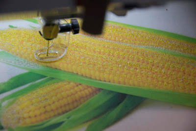
After painting my organza, it was time to get going with the thread painting. Starting with a photo I’d printed on fabric, I began with the very lightest color first. Much of these pieces were sewn in little circles, to imitate the shape of the corn kernels. At some places it was more appropriate to make little scallops, to add highlighting or shadowing to the kernels.
I then layered on color after color of a range from pale beige through sunshine yellow to a dark mustard. In between the rows, oranges predominated to add shadowing… even a touch of a pinkish-orange.
At the end, I added more of the sunshine and lighter colors again, to build up layers and make the kernels a little more dimensional, with the highlights sticking out.
 |
| Corn with thread-painting over all, including husk |

After the corn itself was complete, I thread-painted the husk. I’m not completely sure about my process here or whether I need to do more (or even take away some of what I did. After the thread painting, I laid some of the organza which I had painted on top and stitched it down. I didn’t stitch it entirely over the husk areas, as I wanted some of the pieces to be able to fold back and move in a breeze, like a real husk would do. After sewing it down, I cut around the edge of my sewing.
 |
| Completed corn with the organza husk |
So, what do you think? Red or Orange for the background?
By the way, as many of you know, I’m a big fan of Leah Day’s FreeMotion Quilting project. If you’re looking to gain skill in freemotion quilting, Leah has just come out with a new class on Craftsy. If you go to her blog, you can click a link and get the class for half price! ($19.99 rather than 39.99.)
You Might Also Be Interested in:
 |
 |
 |
| A Slice of Lime | Peppers and Avocado | Cilantro – Si! |
Make sure to check out these other great blogs!
Confessions of a Fabric Addict
Great post on stenciling and thermofax on Nina Marie Sayre’s Art Quilts


I vote for the red. It is darker and makes the corn stand out more. But the orange is nice, too. It will be easier to tell once the white is cut away. Did you sign up for Leah's class? I did! I listened to the first one–really, really basic. I am looking forward to the new designs and the impetus to practice.
Sally
Yes, I signed up for Leah's class. While I've done a lot of the patterns off of her blog, I decided I both wanted to support her ventures and gain more experience and practice. I think she's an excellent teacher. Hope to have a little time this weekend to start out!
Your corn is beautiful. I would go with the orange background the red might overwhelm the corn.
My vote is for the orange, I think the lighter value works better with the corn and green. I love how you did those kernels. Looks so real. And I'm a big fan of Leah Day's now, too.
I am amazed of what you can accomplished. I vote for the orange.
Thank-you Lise!
Thanks for this fabulous post. You teachme so much as an artist? I like the red because it makes the corn deeper and richer.
That was a lot a work to get those kernels just right! By the way, I like the red background. Th corn fades with the orange background just a little.
I agree…the Red makes it pop. And I must say…WOW. What marvelous art you've created here!
I think the green and the orange may be too similar in value, therefore I think the red would be the better choice 🙂
Red – the corn pops (pun intended)on the red background – one the orange, it all blends together more.
Red, it pops!
You are amazing Christina! I prefer the red. It has an organic feel and the dark red reminds me of a dried chili pepper.
LOVE the corn kernels! And I agree with the others that the red is the better background. It brightens the corn beautifully.
You are amazing Christina! I prefer the red fabric. It has an organic feel and the colors remind me of a dried chili.
The oragne washes out your embroidery. I vote for the red background.
ohhh did you hear me say – Ohhh coool – they look good enough to eat! I vote red!
I vote orange, but I always love orange.
I cannot believe how realistic your stuff looks, I am hungry just looking at it. Pass the chips.
I vote orange, but I love orange.
Your stuff looks good enough to eat, pass the chips!
I'm in the minority, it seems, but I like the orange too. Awesome work, by the way! Whoop whoop!!
This is cool — I like your method for painting the "husk!"
Thank-you! Make sure to check out Leah's new Craftsy class!
I think you're right… the orange may wash it out a bit by not having enough value contrast. Thanks!
This comment has been removed by a blog administrator.
Check it out…http://fiberartistjourney.blogspot.com/2013/03/and-winner-is.html I have to agree with you!
Thanks, Misha-
I think you really nailed it… the value contrast works much better with the red: http://fiberartistjourney.blogspot.com/2013/03/and-winner-is.html
So wonderful to hear from you Daniela… I see from your Etsy store that you're on vacation… hope it's somewhere fun! I'm just finishing my chili pepper… maybe it will work well next to this one! http://fiberartistjourney.blogspot.com/2013/03/and-winner-is.html
This comment has been removed by a blog administrator.
I really love the orange material, so perhaps I can use it elsewhere. I did use it in the background of my Tomatillo block and it worked wonderfully there. Maybe as part of a border? Thanks for the comment, complements and your vote. 🙂
Thanks Nina Marie!
Thanks, Jean- I also agree… check out the finished product at: http://fiberartistjourney.blogspot.com/2013/03/and-winner-is.html
Thanks, Sharon. The high contrast of the red did work well.
Are you hanging the salsa collection together? If so, I'd definitely use red. You have two orange ones already. If corn is orange background, too, it will make the pepper look like odd man out.
Personally I like the red better because it deepens the depth of field.
Your salsa is gorgeous!
Yes, the pieces will be all put together in a quilt, specifically to enter in a show called "Salsa." Thanks, I agree about the red… Check out the post with it finished!