I’ve always found beaches to be an incredible source of inspiration for me.  We’re lucky here in the Pacific Northwest to be surrounded with water, mountains, and greenery. Every once in a while, we even get to bask in some sunshine out in nature.

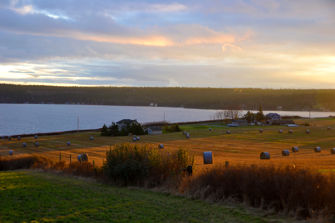
This weekend, I was up at our getaway on Whidbey Island, a 2 hour trip from our home.  The day cleared up for a short while and I took our dog for a beach walk.  What a glorious day.  This great blue heron was a little far for my camera lens (and my dog was a little too close for his comfort to stay while we advanced towards him!)  But I loved the composition and think I could make a lovely pictorial quilt from this photo.

While I love beaches and sea creatures, one could imagine they might cause some bittersweet feelings for me.  Many years ago I was an extremely active scuba diver.  I was a certified PADI rescue diver and was working on my Divemaster certification.  I assist-taught classes for beginning scuba, which meant I was diving a minimum of twice a week.  I was a diver for the Seattle Aquarium, giving shows of hand-feeding the fish (even the 4-5 foot dogfish, a native shark) on a regular basis.  For those of your from warm climates, go ahead a shiver… the Puget Sound is about 40-42 degrees F. year-round.  But the diversity of sea life is incredible in our region.  It’s like going to the Amazon rain forest, only under water.

Unfortunately, while I was starting my second year in college in oceanography/ marine biology, I had a diving mishap and ended up in a decompression chamber.  It was never 100% certain that I actually had “the bends” or whether I had a pinched nerve from carrying the heavy tank on my back.  However, the result was that I needed to choose to either quit diving or risk the potential of a serious or life-threatening injury if I were to continue.

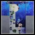
I chose to turn the page to a new chapter in my life.  I also still choose to find joy in beaches and the sea life that I can experience, rather than holding any negativity or resentment towards my loss.  Even though I won’t ever really get to have the incredible experience of being weightless and discovering the underwater world again, I cherish my memories.  I’d love to do more artwork based on our native Northwest marine life.

One of my friends from the Contemporary QuiltArt Association, Carla Stehr, makes incredible quilts based on photographs she takes with a scanning electron microscope for her job at NOAA.  She has even published a beautiful book of photographs called “Sea Unseen” of these microscopic organisms.  Here is a video of Carla speaking about her work and it’s influence on her artwork:


Note: If you’re interested in obtaining a copy of Carla’s book “Sea Unseen”, she does have a few copies still available for sale.  Let me know via a comment and I’ll get you in touch with her.

Another wonderful aspect of the beach is finding treasures, such as this rusty grate which I found this weekend.  I’ve been saving up some rusted pieces of metal that I’ve collected off the beach and this one takes the prize!  I think the patterning will make some amazing rust-dyed fabric.

How do you feed your creative muse?  Do you have special places to go to be inspired?

You might also be interested in:

Viewing for Inspiration Sunshine and Sand- 
Design Inspiration
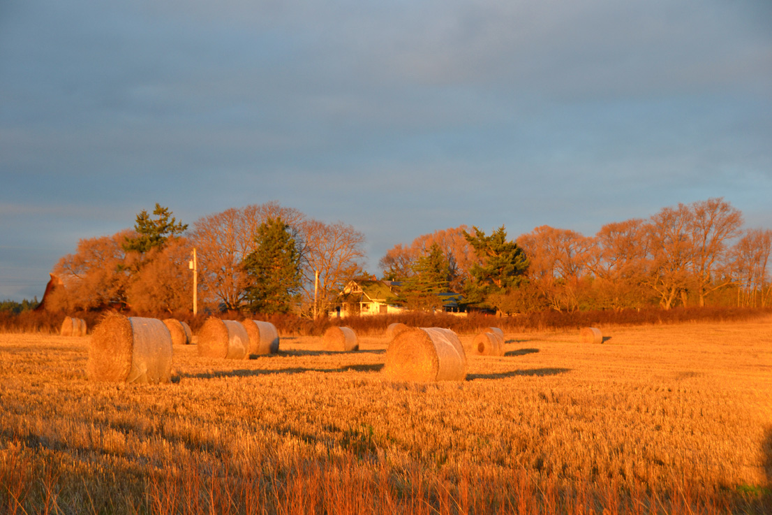
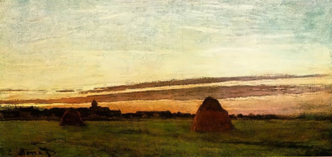
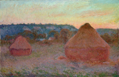
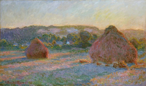
Golden Hour at Penn 
Cove & Monet’s Haystacks

You might want to start with a little history and look at Designing for a Theme: Innovation Part 1.

Artist rendition of Graphene molecules

With the topic “Fiber Artists Look at Innovation and Civic Action”, I personally decided to narrow down possibilities by choosing to represent innovation.  Since I’ve always enjoyed science, I started with looking at scientific journals and find out what some of the recent innovations have been that are expected to revolutionize areas of our lives.  This is where I found out about Graphene.

Graphene, a form of carbon only one atom thick and in a hexagonal cellular structure, is both the thinnest and strongest substance now known to man.  Scientists believe it will revolutionize technology from computer and mobile displays, medical devices, aerospace, desalination plants, electronics and countless ways which we cannot yet predict.  Since I’m a technology fan and my husband’s business is in aerospace, this seemed like a good place to start.  If you want to see a really cool futuristic video, check out this short YouTube “Future Applications of Graphene.”

So now I had a topic to try to represent to go along with the theme… but what could I do with it?  I decided I wanted to represent both the uniqueness of the material (thin, lightweight, hexagonal cellular structure) as well as some of the possible applications of the technology.

Another little aspect that I had to keep in mind was the unusual gallery space that this piece would (hopefully) be hanging in.  The walls were mostly all a deep dark forest green (with a hint of teal) and a couple that were a bright spring green.  Not exactly easy to hang anything on, but ok if you’re specifically designing for the backdrop color.

My idea was to have a thin sheer layer cut in a hexagonal pattern that would fiat above the quilt, which would be surfaced designed to tell more of the story. I started the quilted layer with white Pima cotton. I bought some plasticized wire garden fencing that had hexagons as its design, and started with placing it on top of the white fabric and spritzed jacquard Textile Paint through it. This created a resist, with a painted background (in blues and greens) with a shadowy faint white hexagonal grid.

Representation of a computer touch-screen made with a
thermofax silkscreen and hand-painted shading

I then created several black and white images from photos (using Photoshop) of things that will have future applications using graphene. These included a commercial airplane, computer circuit boards, a smartphone, and a computer touchscreen. I then turned these images into silkscreens using a thermofax machine. I layered these different images around on the background, using Versatex print ink.  I added some hand painting and when the paints were all dry, I finished the back/quilt with a diamond grid pattern for the quilting, as well as freemotion elements around each of the special elements.

Silkscreened computer circuit board with gold metallic
thread freemotion quilted to look like metal elements.

Now it was time to figure out how to represent the one-atom thick sheets of this hexagonal carbon molecule. I knew I wanted to have it be somewhat sheer (and black, since it is carbon, after all.) I thought that using a black organza might get the effect I wanted, so I bought some of each silk, rayon, nylon and polyester organza to test. I had a couple of different ideas on how to cut out a grid that wouldn’t ravel and could hold up, yet not be too terribly difficult or end up too uneven.

Some of my samples testing different organzas and ways to
cut and make sure they wouldn’t fray

The most consistent method and material turned out to be painting the nylon organza with matte medium, drying it, and cutting out the interior hexagons with small, sharp scissors. I’d been a bit surprised by this, thinking that a hot knife might cut and melt a synthetics edges at the same time, but it proved to be more difficult and harder to be exact than using my small Kai scissors.  Also, I tried treating with different products with varying degrees of success.  Some items made the organza too stiff (I wanted it still to be able to move in a breeze, to demonstrate the thinness of the graphene); others, like Fray Check, left a shiny plastic-like coating.

Close-up of grommet, copper pipe
& bead hanging mechanism
The organza hanging

You can imagine the time it took me to cut out each of the little hexagons on the finished piece!  The next step was to figure out how to affix the top layer so it would hang out separately from the quilted back piece.  This turned out to be quite tricky.  After many trials and errors, I was able to get a decent effect using some heavy-duty grommets, 1/8″ copper piping, copper wire, and beads.

Thankfully, my efforts were rewarded by the jury and my piece was accepted into the show!  Here is the final piece, hanging at the Seattle Center Next 50 Exhibition!  I particularly like how the hanging grid creates such interesting shadows with the gallery lighting.  The only disappointment to me was that the show chair who mapped out where each piece was to go, choose to put my piece on one of the couple spring green walls, after I’d designed it to go on the dark green ones!  Well, you can’t control everything!

“Graphene: The Miracle Material” by Christina Fairley Erickson
Whole-cloth 100% cotton background quilt hand-painted, silk-screened and machine quilted by artist.  Upper layer nylon organza treated with matte medium and cut into hexagonal grid attached with copper pipe, copper wire, beads and metal fittings by artist.

You might also be interested in:

Designing for a Theme… 
Innovation Part 1
Designing for a Theme Journeys Show at 
SeaTac Airport

I’ve been thinking once again about designing with a specific theme in mind.  If you have entered into juried shows that have a theme, you know the dilemma.  How literal do I need to make this piece to fit the theme?  Or perhaps you’ve just skipped entering those shows.

Since my preferred style in which to make art is representational or pictorial, I don’t usually have a great difficulty with making something to fit a theme.  My struggle is more about whether I really want to make a piece or not for that show.
As an example, I’d like to share about the 50th Anniversary Celebration of the Seattle Center.  In 1962, Seattle was the home of the World’s Fair… the grounds on which the fair was held is the Seattle Center.  Most notably, Seattle’s best-known landmark, the Space Needle was built for this 6 month festival and exhibition.

Helen Remick’s “Spinning Out, Spinning In 1” (left)
and Margaret Liston’s “Save” (right)

Seattle Center put out a call to artists for large proposals to show during the 6 months of the Next 50 Celebration.  The theme of the overall exhibit and performances was “Illuminating Today’s Challenges, Imagining Tomorrow’s Possibilities.”  The call was set up as a two-tier process.  You sent in an extensive original proposal through Café (Call for Entry), including a series of images representative of your art.  


As I am the Exhibitions Co-Chair of the Contemporary QuiltArt Association, I prepared this proposal for our group.  The second tier was like a call-back for an audition.  Except now, you had to do an elaborate proposal, including budget, recommendations on where within the Seattle Center grounds that your exhibit would take place, showing how your art would benefit and reflect the theme of the Next Fifty, and finally a video to support your claims of your work.    

Melisse Laing’s “Sorok dva – Russian Collaboration II”


In the end, we did get chosen for an exhibition, but we did not receive any of the grant money… not a big problem as our group doesn’t typically get paid to exhibit.  But when it came down to the “theme”, they decided they wanted to be even more specific.  The dates chosen for our group’s exhibition were during September and October (2012).  Each month of the celebration had a focus… September’s theme was “Commerce and Innovation” and October’s was “Civic Action.”  So, the name given for our exhibit was “Possibilities: Fiber Artists Look at Innovation and Civic Action.”  Can you imagine trying to get a group of quilt artists to tackle that as a theme?  (Imagine a great big eye-rolling from me here.)

Artist and CQA President Marylee Drake with
her piece “Gearing Up for the Future”

But, somehow our artists always come through with a wonderful show as you can see from the photos above.  Tomorrow, I’ll talk about and share some photos of the process I went through to make my piece “Graphene – The Miracle Material.”

You might also be interested in:
Designing for a Theme
A Day of Art
Making Fabric


Looking South towards Penn Cove

Have you heard of the photographer’s Golden Hour?  This is the hour right at sunrise and also right before sundown.  With the sun low on the horizon, shadows are either non-existent or elongated due to the sun’s small angle with the horizon to create interesting effects.  The lighting is more diffuse, softer, and a much warmer hue, as the sunlight is traveling through more of the atmosphere and reduces the direct light and increases indirect light from the sky.  The light then appears more reddish as the blue light becomes scattered.

South-west – Hayrolls at Penn Cove at twilight

Yesterday we were driving up on Whidbey Island, WA, right at the golden hour.  Around here, that means about 4-5 pm during the winter, due to our Northern latitude.  The fields with their giant rolls of hay reminded me of some of the paintings of haystacks by Monet.

Monet painted around thirty haystack scenes, at differing times of year and lighting.  He exhibited a group of 15 of these together in 1891 at the Paris gallery of Paul Durand-Ruel, and they were immediately considered a significant breakthrough for Monet.

Hayrolls at the Golden Hour

Monet would work on many canvases at the same time… he’d line them up and switch to another canvas when the lighting changed.  Working from the first light of dawn up until the final hints of light at dusk, Monet sought the essence of how light transformed different objects, such as the haystacks.

Hayrolls and Penn Cove

I like to imagine that if Monet were here at Penn Cove, he would have been just as excited as I was to see the incredible plays of light on the hay, sky, and water.

You might also be interested in:

Dealing with Rejection (more on Monet)
Sunshine and Sand
Skagit Skies

Light is starting to disappear
Monet’s “Hayricks” 1865

End of Day, Autumn – Claude Monet

End of Summer – Claude Monet
Haystacks at Sunset- Claude Monet
Our dogs playing in the water at Moclips, WA, Pacific Ocean

Is there anything as wonderful as a beautiful ocean beach?  There are so many aspects and differences between beach types and we have some truly marvelous variations on the Pacific coast.    I took these photos for design inspiration, when on a trip to Moclips, WA.  The waves carve out intricate patterns in the sand and the incredible play of light brings out fascinating textures.

As design sources, the sand has many possibilities.  Line and shape are represented with rhythm and repetition.  Due to the brightness and contrast, there is very little color, making the images great for playing with a monochromatic color scheme.  Value contrast can be studied and played upon.

When in nature, I look for these types of elements.  Pattern, shape, line, repetition and variation, symmetry, contrast, and texture all create interest in a composition

While I may never make a composition from one of these particular photo, using a camera to train my eye toward good design has become a habit for me.

 At the same time, using these photos could make an interesting series.

The process of just getting out into nature and seeing, REALLY seeing, can help infuse your creative well with more life, giving you the inspiration to bring forth new ideas in your chosen artistic endeavor.

I don’t know about you, but sometimes I struggle with getting out.  I tend to get a little insular, wanting to hole up in my house (especially on cold, rainy Seattle days!)  I always have too much I want or need to do, and I can get caught up in wanting to have time making, rather than gathering more inspiration.  But the process of looking for inspiration can help keep you creating.

Perhaps getting out with my camera each week should be part of my 5 x 7 challenge….  I’ll have to think on it.  What do you think?  Would you like to see design inspiration photos each week?

You might also be interested in:
Skagit Skies
Pacific Madronna
Finding Inspiration Every Day